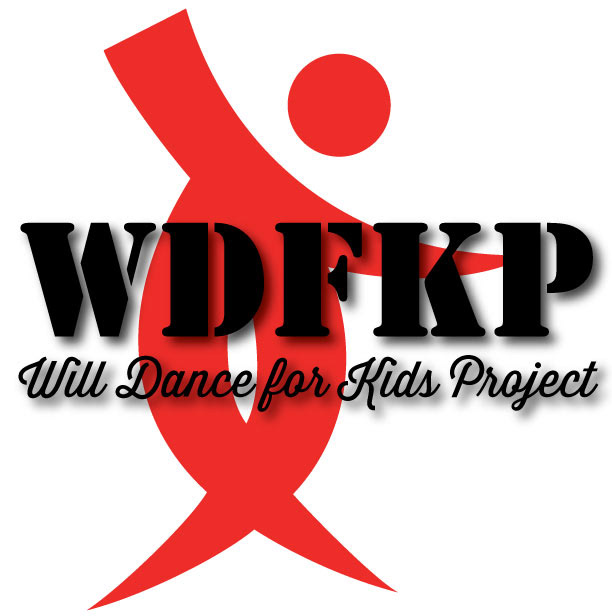
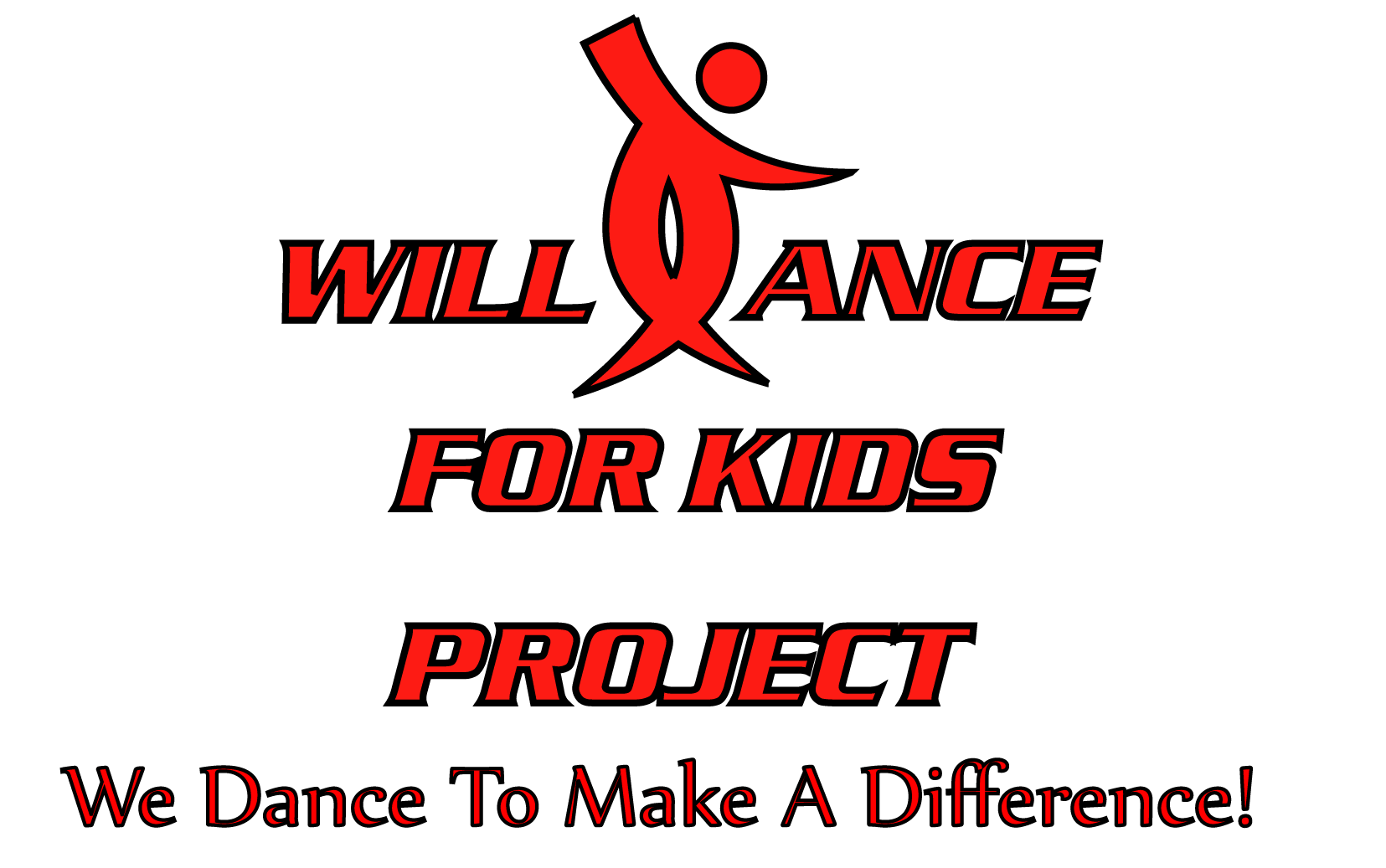
I started working for the Will Dance for Kids Project at the beginning of this year. It's been a lot of fun. However, I have not been a fan of their logo. It's ok, and I like the dancer, but it just didn't look as great as I thought it could be. Here are some examples:

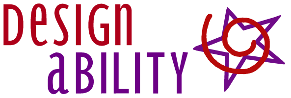
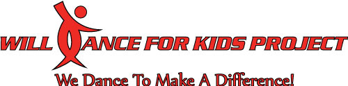
Initially I thought that if I cleaned the logo up and thinned out the stroke it would be ok. It did look better, but I still didn't love it.
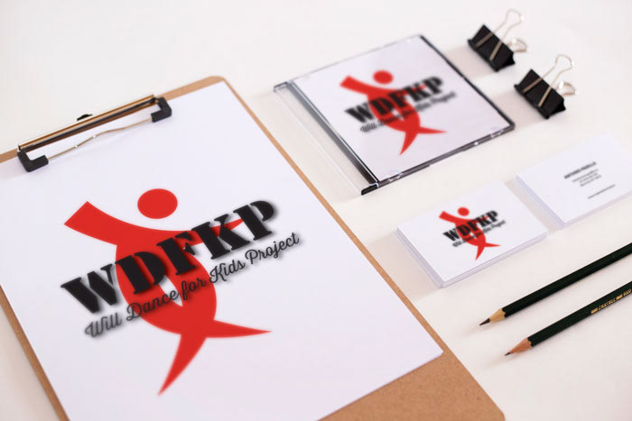
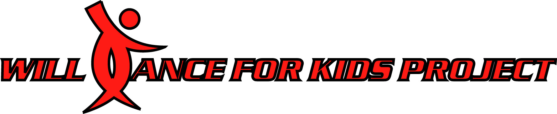
I was also working on their website at the time and started playing around with twirling their dancer. I think it turned out kind of fun, but in the end I didn't actually use this.
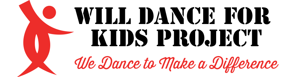
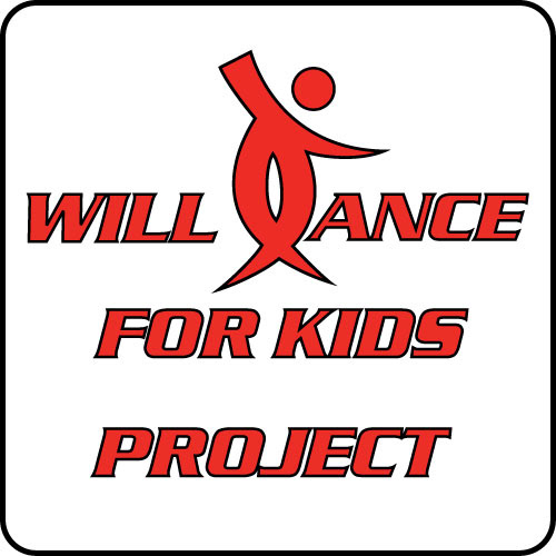
In the end I took a little time and designed some new logos using fonts that we consistantly use. I think they turned out pretty great and are an improvement on the old logo.