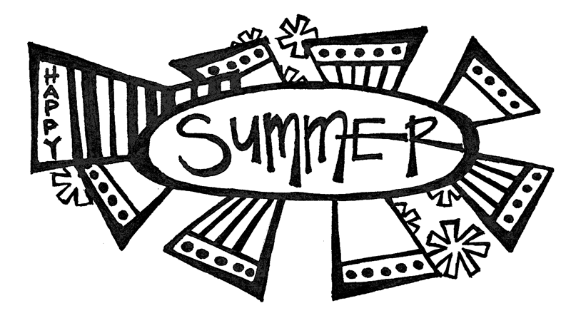
A while back I set out to do a retro design. As it was summer I thought, why not do something along that vein? This was my first idea. I loved the polka dots, the crazy stars and the lettering, but the rest of it seemed a little bizarre - at least for the design I had in mind. Needless to say, this design did not get to the coloring stage.
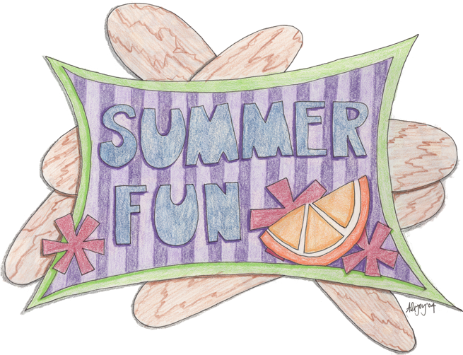
I started completely over with some new ideas. I thought that some popcicle sticks would be fun in the back ground and maybe an orange to add a little pizazz! Ireally liked how the retro rectangle turned out, but as for the popcicle sticks - well they just didn't work. Maybe if they were skinnier or had the popcicles on them...
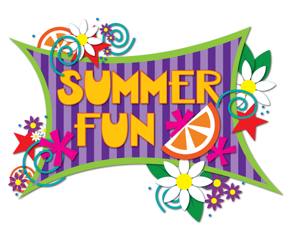
So, I started again. This time, though, I kept the elements that I loved and added some other things - stars, swirls, flowers and dots. I also changed up the lettering again. I was not a fan of the M and N on the previous design.
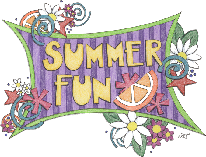
After scanning my design I cleaned it up in Photoshop.
I didn't love the colors, so I brightened the whole design up. And then there it sat for several years. I made a few posters with it, fairly satisfied with the result.

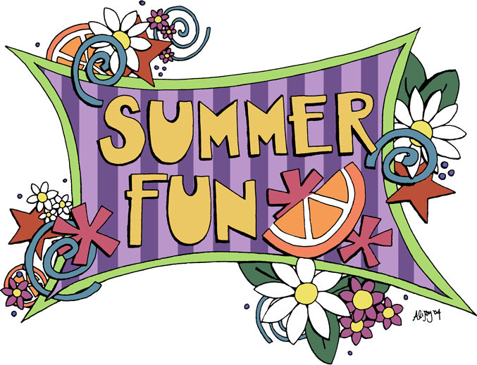
Then this last year I took another look at it and decided it needed an update. Being much more skilled with Illustrator, I pulled the design in there and made it over. With a few tweeks to the design and color I came up with something that I loved.